Appeltern is a difficult place to describe. Basically, it's a permanent exhibition park for show gardens which, as of 2009, featured an astounding 190 individual model gardens. Exhibitors range from large suppliers in the horticultural and construction trades, to smaller landscape firms, to individual designers. At first glance, the concept sounds amazing. I was picturing a permanent Chelsea Flower Show, with more gardens, more designers, and real-life, walk-through gardens. Sadly, while there are some interesting and worthwhile things at Appeltern, overall it just doesn’t work. At the end of the visit, I was left with the awful feeling that I don’t want to see another model garden for as long as I live.

Let’s start with the good things about Appeltern. This may seem superficial, but I was completely blown away by the maintenance of the whole place. I’m not sure whose responsibility this is, but every garden was impeccable. All the plantings were full and lush with not a single diseased plant or weed in sight (maybe this should be worrisome). In the formal areas, everything was perfectly clipped, while in the natural areas, there was just the right balance of contained wilderness.

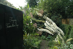
Some gardens were really worthwhile, especially in the Architects Gardens (Architectentuinen) area. They were creative and managed to rise above the crowd, which is pretty impressive in a crowd this size. One of these was the garden by Ton ter Linden (below). We walked into the garden, not knowing the designer, and immediately loved it. It got me thinking about how good gardens are instantly recognizable, and what sets these gardens apart from the rest?

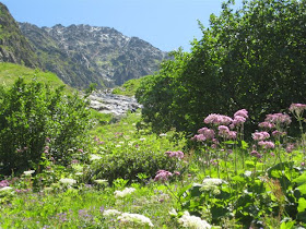
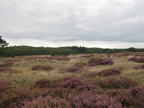
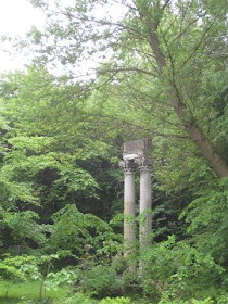
Now to the bad part. It’s difficult to put a finger on what exactly is wrong at Appeltern. As I think the pictures show, there are many good things here (all the pictures are of the 'good' stuff), and in fact none of the gardens were obviously ‘bad’. However, at their core, it seemed to me that the majority of gardens suffered from an unshakable feeling of fakeness (sorry, that’s the best term I can come up with). Clearly, the gardens are ‘fake’ because of the very premise of the park. Most other art forms, such as paintings or sculpture, are easy to exhibit. Garden exhibition, however, is a tricky thing, and a garden must be that much better to succeed in such a setting. It’s certainly possible, but unfortunately most gardens at Appeltern don’t manage to achieve this.

In many gardens, the ‘fake’ element was obvious – anything with a perfectly set ‘entertainment’ area or a built-in barbeque (the whole ‘outdoor living room’ concept) automatically falls into this category for me. Disappointingly, even many of the gardens with no specific tacky elements felt that way. The gardens that tried to break out of the mold by offering something new and creative seemed like they were just copying the latest trends.

But perhaps the biggest downfall of Appeltern, ironically advertised as its biggest attraction, is the sheer size of the place. At 13 hectares (32 acres), it took us a few hours at a brisk pace to get through it. At the end, we were completely gardened out. Nobody can enjoy and absorb this many gardens. Gardens are supposed to be unique and magical, not 190 in a row.

Overall, I wish I could erase my experience at Appeltern. It has tainted my view of show gardens by reducing them to mass-produced, assembly line commodities (of which gardens are supposed to be the exact antithesis!). Gardens are meant to inspire a feeling, to evoke an emotional response. As a place that is supposed to be a source of education for the gardener, I suppose Appeltern teaches us that great gardens can’t be achieved simply through nice paving, some plants, and the latest outdoor decoration.

 Let’s start with the good things about Appeltern. This may seem superficial, but I was completely blown away by the maintenance of the whole place. I’m not sure whose responsibility this is, but every garden was impeccable. All the plantings were full and lush with not a single diseased plant or weed in sight (maybe this should be worrisome). In the formal areas, everything was perfectly clipped, while in the natural areas, there was just the right balance of contained wilderness.
 Some gardens were really worthwhile, especially in the Architects Gardens (Architectentuinen) area. They were creative and managed to rise above the crowd, which is pretty impressive in a crowd this size. One of these was the garden by Ton ter Linden (below). We walked into the garden, not knowing the designer, and immediately loved it. It got me thinking about how good gardens are instantly recognizable, and what sets these gardens apart from the rest?
 Now to the bad part. It’s difficult to put a finger on what exactly is wrong at Appeltern. As I think the pictures show, there are many good things here (all the pictures are of the 'good' stuff), and in fact none of the gardens were obviously ‘bad’. However, at their core, it seemed to me that the majority of gardens suffered from an unshakable feeling of fakeness (sorry, that’s the best term I can come up with). Clearly, the gardens are ‘fake’ because of the very premise of the park. Most other art forms, such as paintings or sculpture, are easy to exhibit. Garden exhibition, however, is a tricky thing, and a garden must be that much better to succeed in such a setting. It’s certainly possible, but unfortunately most gardens at Appeltern don’t manage to achieve this.
 In many gardens, the ‘fake’ element was obvious – anything with a perfectly set ‘entertainment’ area or a built-in barbeque (the whole ‘outdoor living room’ concept) automatically falls into this category for me. Disappointingly, even many of the gardens with no specific tacky elements felt that way. The gardens that tried to break out of the mold by offering something new and creative seemed like they were just copying the latest trends.
 But perhaps the biggest downfall of Appeltern, ironically advertised as its biggest attraction, is the sheer size of the place. At 13 hectares (32 acres), it took us a few hours at a brisk pace to get through it. At the end, we were completely gardened out. Nobody can enjoy and absorb this many gardens. Gardens are supposed to be unique and magical, not 190 in a row.
 Overall, I wish I could erase my experience at Appeltern. It has tainted my view of show gardens by reducing them to mass-produced, assembly line commodities (of which gardens are supposed to be the exact antithesis!). Gardens are meant to inspire a feeling, to evoke an emotional response. As a place that is supposed to be a source of education for the gardener, I suppose Appeltern teaches us that great gardens can’t be achieved simply through nice paving, some plants, and the latest outdoor decoration.


